6 Dreadful Design Mistakes That’ll Ruin Your SEO
Artists hate constraints. It’s because their profession has crafted an image of being ‘free’. It’s believed that only without boundaries can an artist wander in the sea of immense creative possibilities.
Similarly, if you’re a webmaster, you’ll probably not like to limit your designer’s potential. You’ll let him or her experiment with animated designs and you’ll hope that he’ll craft an elegant design that’s pleasing to your eyes.
Is there a problem with this design approach without rubrics?
Yes.
Such a website might not be optimized for search engines. So, while the aim of your designer might be to flatter your visitors with a mind-blowingly stunning design, that beauty won’t deliver strong business results.
Why?
Because you will not get any website visitors in the first place.
Let’s zoom out a little and think of the reason why you wanted to create (or redesign) your website?
A major goal will most likely be getting more business from your website.
Am I correct?
Your website’s design is the most crucial aspect to helping you close more sales. A research study titled Trust and Mistrust of Online Health Sites found that 94% of user comments are directly related to website design elements like website intros, layouts, etc.
But, there’s no point in designing a website that isn’t appearing in search results to serve your consumers.
You need to probably approach this from a different artistic perspective.
Website design and marketing for your business don’t work in silos. View the constraints as a challenge and balance elegance with search engine requirements.
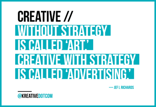
In this context, I am reminded of what Prof. Jef L. Richards said.
Yes, Google is getting smarter everyday. But, you still need to feed its bot by following standard webmaster guidelines to ensure a great user experience for your visitors. Otherwise, don’t expect any free traffic from the search giant.
With respect to design, there are a few common mistakes that hamper your website’s search performance. Whether you’re designing a new website or redesigning an existing one (with good search rankings), you can’t afford to commit these.
The image of a starving artist (or designer) only sounds romantic. You don’t want to be that guy.
The value that you’re providing on your website needs to reach your audience, because it’s your duty to serve them.
Avoiding these 6 design mistakes will ensure that your website doesn’t get lost in search rankings and that your work reaches your customers.
Download this cheat sheet of 6 dreadful design mistakes and learn how to overcome them.
Ready?
Let’s begin with the first mistake.
1. Including important information in images and not optimizing on-page elements
Let’s agree on something.
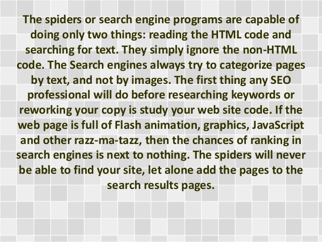
Text is still the content most easily comprehended by search engines.
Yes, serving podcasts, images and videos to your audience might make them happier and help you receive better engagement skype.
But, search engine spiders also crawl media content by looking for keywords in prominent locations.
When it comes to your website’s most important content, remember that these elements are ignored by search engines – including images, flash files and java applets.
You don’t need to just take my word for it.
Here’s an excerpt from Google’s official webmaster guidelines.
Try to use text instead of images to display important names, content, or links. The Google crawler doesn’t recognize text contained in images. If you must use images for textual content, consider using the ALT attribute to include a few words of descriptive text.
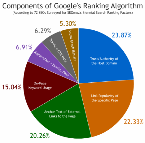
If you replace your text headers with images, your content might look amazing. But, for search engines it’s a useful on-page element that helps them understand the meaty keywords from your content. It accounts for a 15% chunk of Google’s Ranking Algorithm.
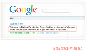
Your SEO title (50-60 characters), meta description (150-160 characters) and keyword density remain important elements for your webpages.
Here is an example page that’s properly optimized for the keyword “running shoes.”
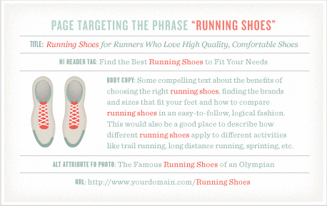
A compelling meta description and SEO title will also help you in gaining better CTR in search results.
Once you’ve completed these on-page elements, next come visuals. Image optimization is more important than you think. As per Roman Bebenista, a website that’s well-optimized for graphics can see anywhere between 20 to 60% of all traffic from Google.
Convinced that you need to spend time optimizing visuals?
Here are 4 tips on image optimization.
1. Use the alternative image tag to describe your visual elements accurately. This helps search engines to understand what’s inside the image.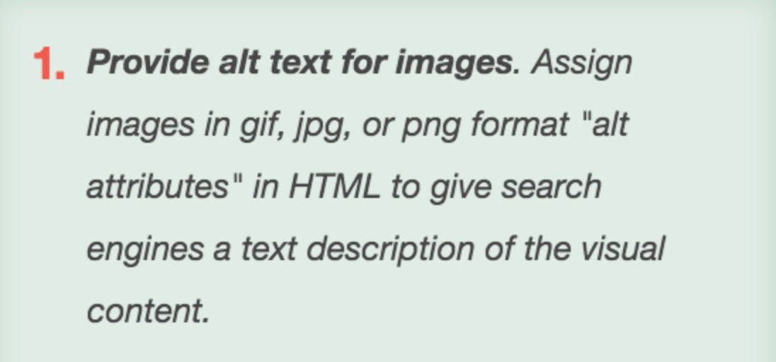
2. Google recommends that every page in your site hierarchy be accessible from at least one static text link.
Preferably, you should stay away from using image based menu items. This isn’t just because Google can’t read text inside images, but because it limits the accessibility to your users on mobile devices.
Stick with text-based navigation links to ensure that your search crawlers don’t miss them.
Look how Swansonvitamins.com lists all its important website pages in its footer. Search engines cannot miss indexing these pages.

You can also group all of your high value links into categories. It’ll make your footer easily understandable and usable.
Look how Apple groups its important website pages.

3. Don’t provide important business information, like your business contact details and addresses, inside images in your website’s header/footer.
Instead, share it directly, using text like Jarad Johnson did audi simulator kostenlos downloaden.
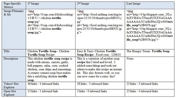
4. Ideally, Google expects you to avoid generic image names like IMG0001.JPG. Use descriptive names like my-new-marketing-post.JPG instead.
A study at Moz found that the Google Image bot looks at factors other than the alt image tag and filename. Specifically, it looks at your title tag, meta description, heading tags, links and anchor text. You should also host all of your images.
If you want more tips on image optimization, then watch Peter Linsley’s presentation on Google Image Search below.
Similar to images, Google expects you to provide relevant mark-up information (with schema.org) for your videos.
The relevance of your video content is determined by the transcript, the surrounding text, the caption and the meta information that you share. But, the quality of the content in your videos is the key in getting more engagement and building a loyal audience (that also ultimately affects your search standing).

While we’re on visual optimization, I would also recommend that you not configure your video pages with complex JavaScript, Flash, and hash tags. They would not surface correctly in video search, as Google can’t provide a unique URL to the users.

Ideally, your goal should be to include text on all of the pages of your website.
What if you’re running a podcast?
You should still write some text with your show episodes explaining who you interviewed and what you talked about.
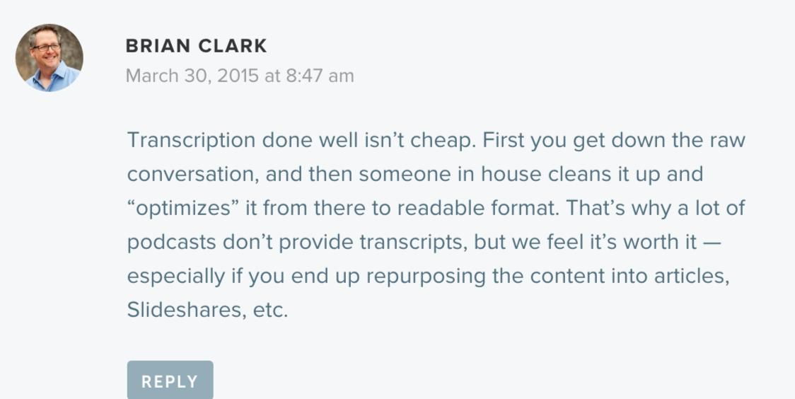
On the New Rainmaker podcast, Brian Clark transcribes some of his audio interviews.
This helps him to gain search traffic and serve both types of audience – those who like text and those who like audio content.
As an example, the transcript for the ”How to Start a Podcast Network Episode” episode is located right below the audio.

As Brian Clark points out – once transcribed in a readable format, you can repurpose the podcast into slideshares, articles, etc.
Tools to find out how search engines see your website
When in doubt regarding how search engines view your website, you can use SEO-Browser.com.
It gives a clear picture of what elements of your website are visible/indexable and which ones are hidden.
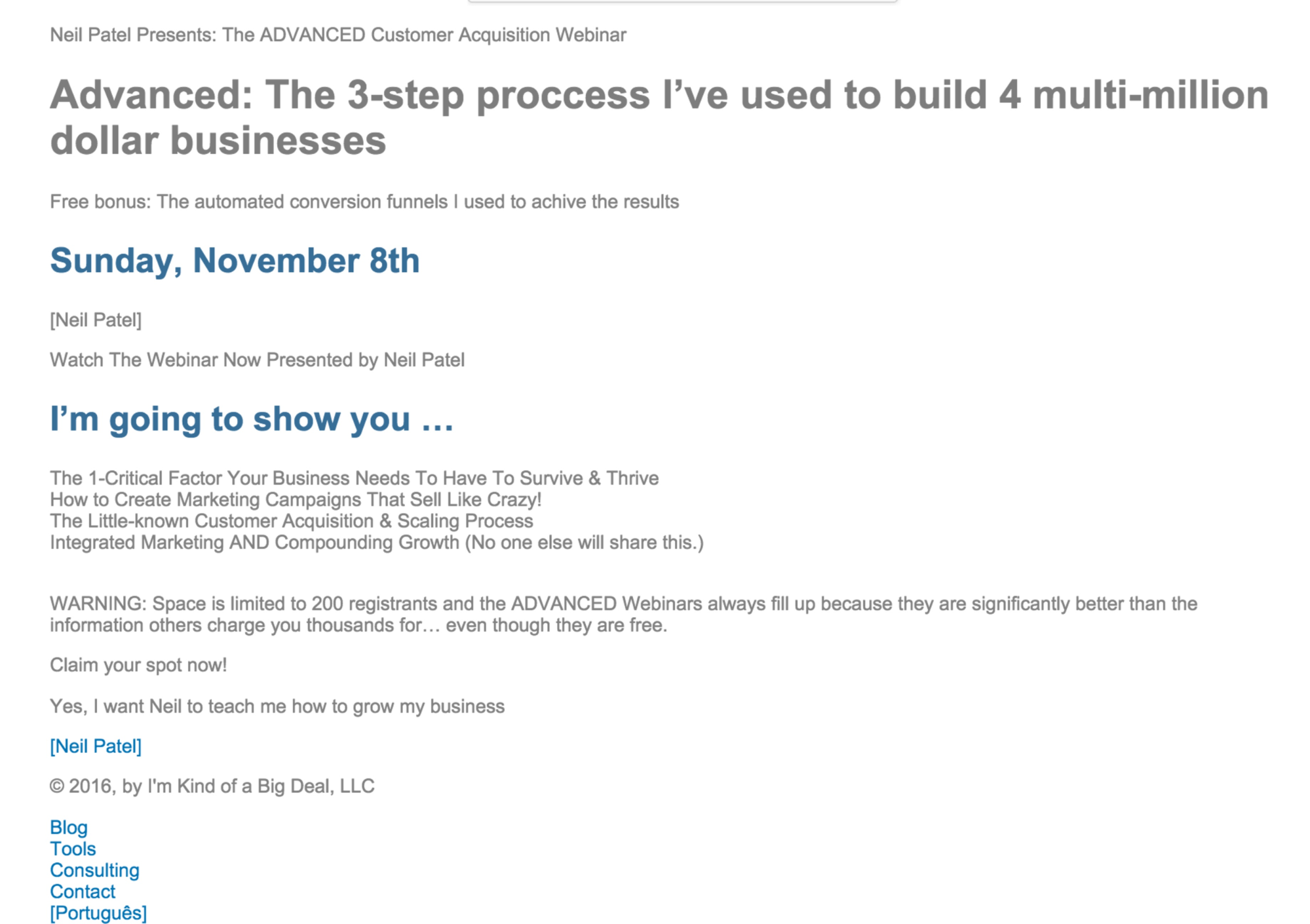
Have you seen my homepage?
This is how search spiders view it.
Using it is simple.
Just head over to SEO-Browser.com and enter your website in the address bar.

Tick the “I’m not a robot reCAPTCHA.” Then, click on the ‘Simple’ button herunterladen.
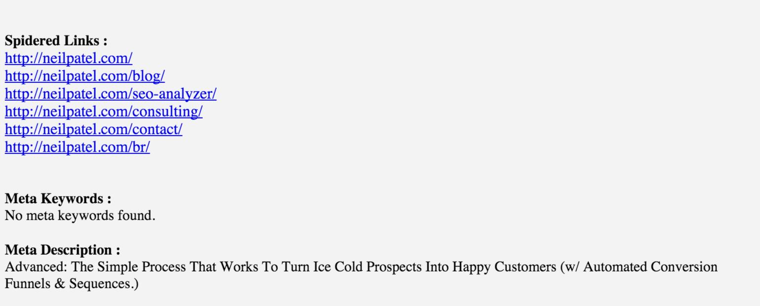
Alternatively, you can also use the Search Engine Spider Simulator by Webconfs.com.
Besides spidered text, it’ll also show you the spidered links, meta keywords and meta description for your entered web page.
Look at the results for my homepage.
2. Not caring about your mobile visitors
Are you still confused about whether or not your website should be responsive?
You need to read the following statistics.
- 78% of local mobile searches lead to offline sales.
- Consumers spend 69% of their time on mobile.
Google has even rolled out an algorithmic update, in March, 2015, to demote websites that aren’t mobile-friendly. And, mobile-friendly websites saw an average of a 12% increase in visibility on Google mobile.

Data from Smart Insights shows that non-friendly mobile pages have dropped an average of 5 places in search results.
But, do you need to build dedicated mobile websites?
Although responsive website design isn’t an official ranking factor, it is Google’s recommendation to webmasters for making their websites mobile-friendly.
The reason is that Google doesn’t have to index separate URLs (when you implement a dedicated mobile website) and the same HTML is served to all devices (unlike dynamic servers).
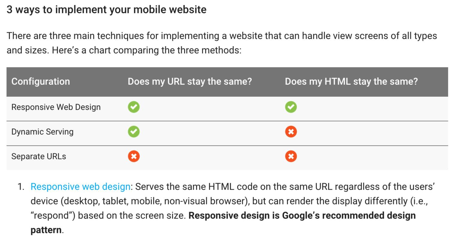
A responsive design will offer a consistent user experience to your visitors across all devices. The display is rendered differently based on a user’s device.
The benefits of responsive design also include increases in your website engagement and reduction of your bounce rates.
TSYS implemented their digital experience (based on principles of responsive web design coupled with digital marketing tactics) for a global financial institution based in Europe. The outcome was better profitability, reduced expenses and better customer engagement.

So, how can you get started with making your website mobile-friendly?
A convenient and SEO friendly option is to use a content management system like WordPress. It has a one-click installation. Then you just need to choose a responsive theme and mix in a couple of SEO plugins like Yoast SEO.
If you want to offer a superior experience to your users, you can purchase a responsive theme from marketplaces like StudioPress or ThemeForest. Just set the ‘mobile responsive’ filter.

Once you’ve completed a responsive design, test your website to ensure it runs smoothly itunes download windows 7 32 bit. You can restrict downloads of full-sized images meant for big screens and limit the number of HTTP requests (as well as CSS and JavaScript).
But, ensure that the design supports any other specific customer requirements like shopping carts and account logins.
You can even spy on competitor websites in your industry and adapt great ideas from them on yours.
Here are 3 webmaster tools by Google to help you pass the mobile-friendly litmus test.
1. Mobile-Friendly Test – Just key in your website and press the ‘Analyze’ button.
If your website receives a green message like the one below, your webpage has passed the test.
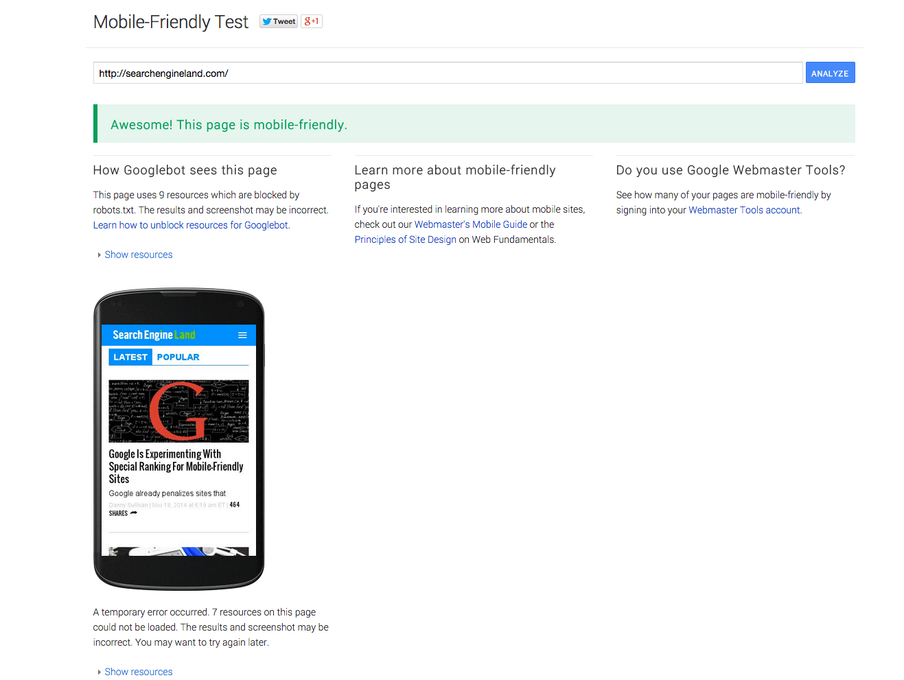
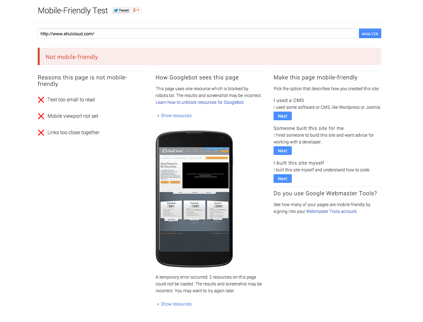
In case your website isn’t friendly, you’ll receive recommendations to take corrective measures.
Like Shulcloud.com received below.
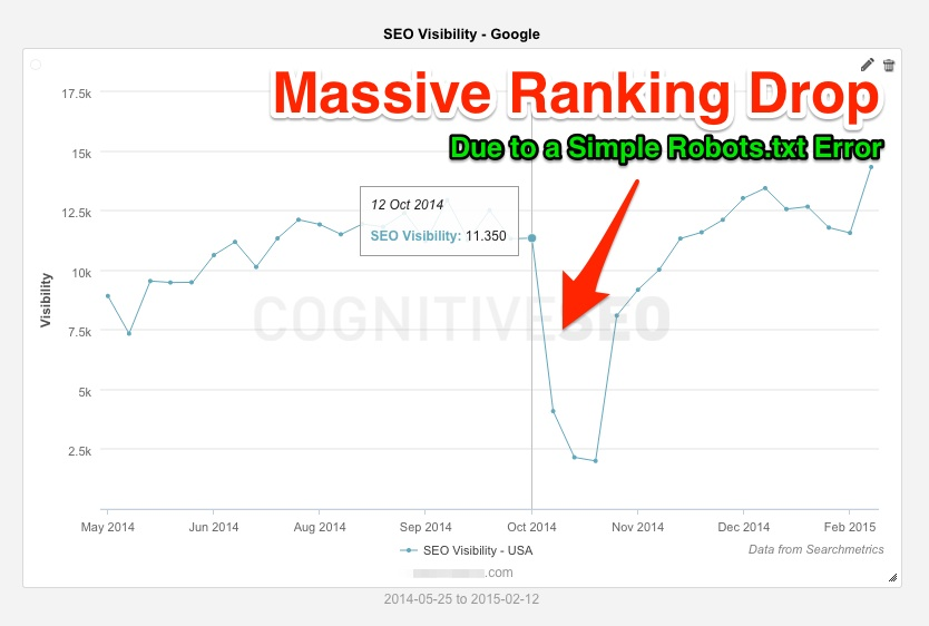
2. Robots Testing Tool – Due to a single robots.txt error you can experience a huge drop in your search visibility.
Google’s robots testing tool will show you how Google crawls your robots.txt file and report any errors.
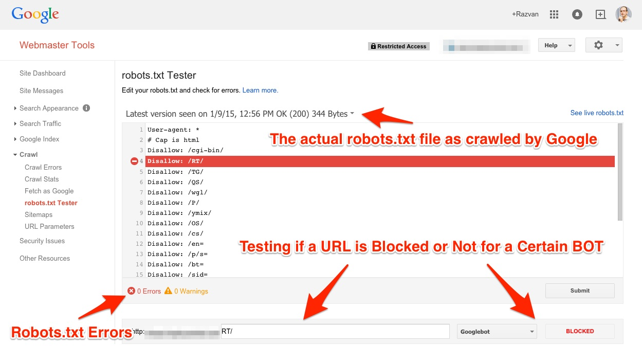
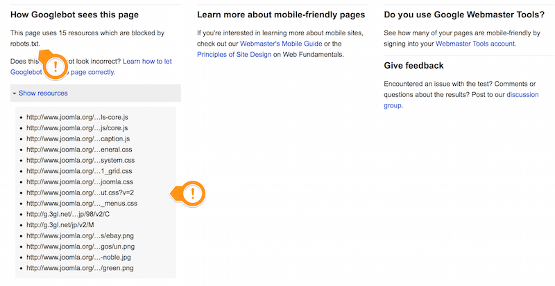
As an example, look at the default robots.txt file in Joomla below. Google bots are blocked from accessing the images and templates directories. This website will be deemed mobile incompatible by Google, so the webmaster needs to diagnose and repair these issues.
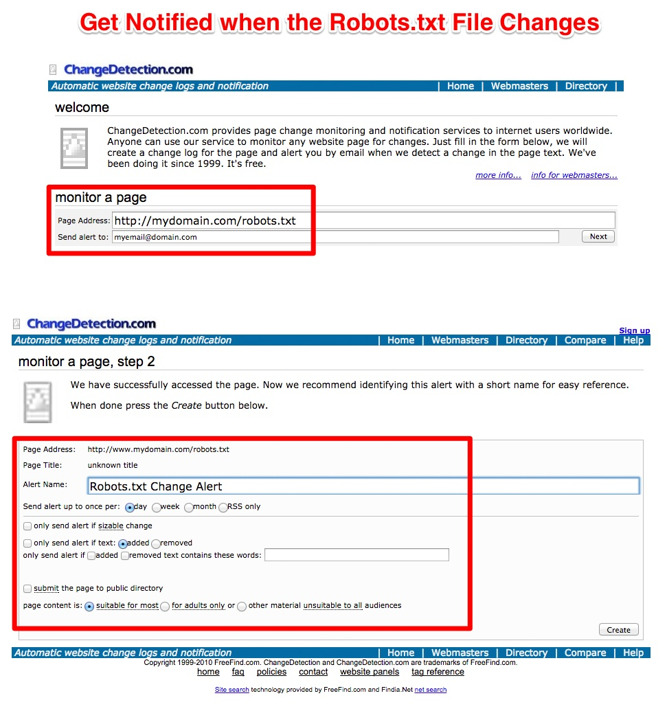
You can also setup notifications for robots.txt file changes using a free tool – changedetection.com.
3. PageSpeed Insights – As you might know, internet connections on mobile devices are slower. And with our shrinking attention spans, a split-second delay in your web page loading might be worth a thousand dollars of business loss.
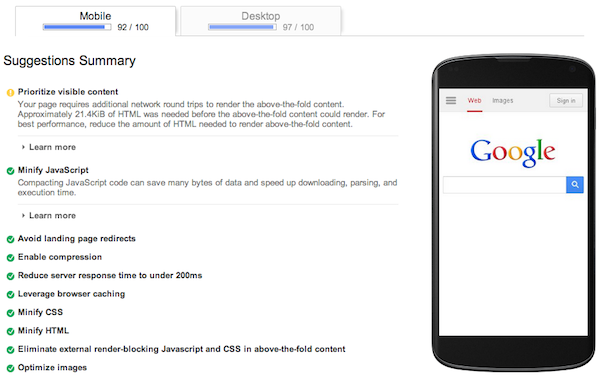
Page Speed Insights is a great tool that grades your website based on its speed. And, it also offers some recommendations for speeding things up.
Unless you have specific requirements and the necessary resources, stay away from designing a dedicated mobile website.
- You will need to allocate resources and budget to manage both of the websites separately.
- It might lead to divided PageRank between the two versions of your page or duplicate content issues if you don’t configure your web pages properly.
You’ll need to perform these additional steps to ward off such issues.

- It can create unnecessary complications like faulty redirects.
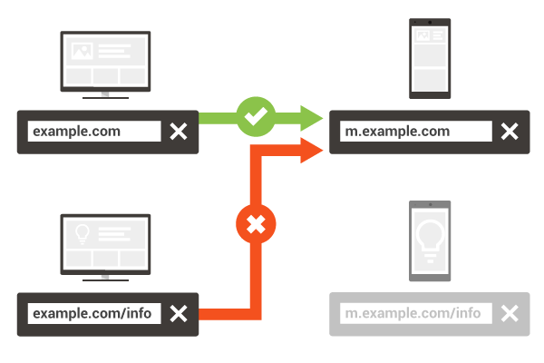
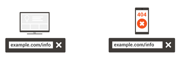
And, you also need to redirect smartphone users to the appropriate and separate URL, not a 404 error page lebenslauf programm kostenlosen chip.
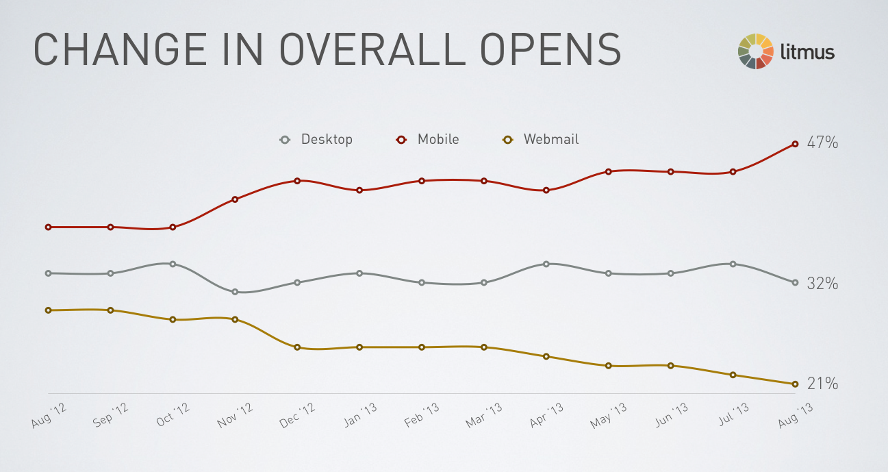
The responsive experience doesn’t need to end on your website. As of 2013, Litmus found that 47% of marketing messages were opened on mobile.
In a 3 week test, CareerBuilder achieved a 15%-17% increase in email open rates and a 21%-24% increase in CTR by shifting to a responsive email design.

Most email marketing service providers like Aweber, MailChimp and GetResponse offer responsive email templates and you can use them to cater to your mobile users.
3. An elegant 404 page
I’m going to guess that you don’t want to lose your first time visitors who might have typed a wrong URL or visited a broken link on your website.
You want to create a great experience even for these visitors so that they remember your brand. After unleashing your creative side, you crafted a memorable 404 page.
But you know what?
You might have forgotten to add one essential element…
A link back to your website pages.
It seems so trivial that most webmasters miss it.
But a broken link without proper navigation options is not just bad for user experience. It can eventually lead to a loss of search rankings.
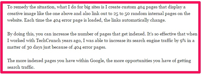
On the other hand, linking to random pages is so effective in increasing the number of indexed pages that I’ve personally increased Techcrunch’s traffic by 9% in a month using it.
Want to know how?
By running an algorithm that linked to 25-50 random internal pages from the website.
You can also link to your most popular pages, like ModCloth does.
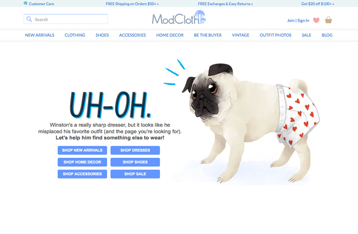
But, please include at least one link back to your homepage, like Deviant Art.

Don’t leave the visitor confused and let him or her drop off by using technical jargon like the 404 page below.

A well-crafted 404 page can re-engage an unhappy visitor or even turn them into an email subscriber if you offer a free eBook, like Leadpages does on its error page.

You need to carefully watch out for 404 pages, especially if you’re re-launching your website.
For a client website, Ben Cook and his team created a contact form on the 404 page. The reason was that the existing site structure was old, with thousands of pages and files. Serving 404 pages to the visitors was inevitable.
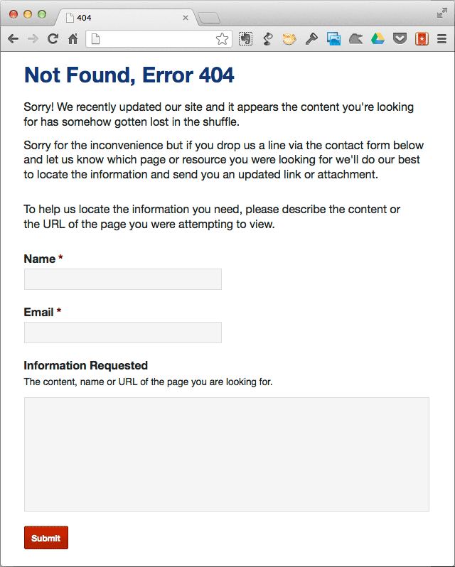
On the contact page, Ben apologized for the mess and asked for missing information. He also assured the visitors that “we’ll find it and send you an updated link or include the file as an attachment.”
The website visitors were convinced, so Ben and his team received several emails requesting information

4. Serving irrelevant and intrusive pop-up ads
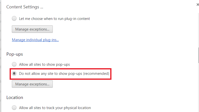
They aren’t indexed by search engines. They mostly aren’t even a part of a designer’s work plate. Web users tend to click on the close button as soon as they appear. No wonder Chrome by default blocks them from appearing herunterladen.
But, they still have made it to mainstream usage due to the incredible results they drive.
I am talking about pop-ups.
Yes, they can be really intrusive. 70% of Americans complain that they are annoyed by irrelevant popup ads.
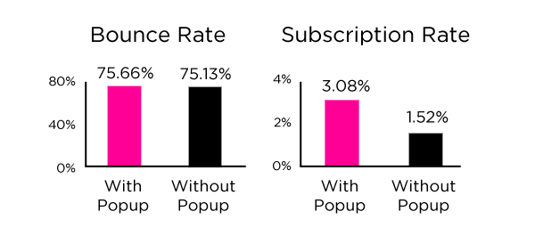
But, they’re a great tool for increasing your email signups. Dan Zarrella found that his subscriptions doubled with popups. And, interestingly, his bounce rate remained the same.
Even Entrepreneur.com found a 162% increase in sales by serving limited time offers in pop-ups to targeted visitors.
I don’t want to get in the debate of whether pop-ups should be used despite them being bad from a user experience perspective.
There is, however, one kind of pop-up that I would advise you to stay away from…
Ads, like the one below…they just hurt the eyes.
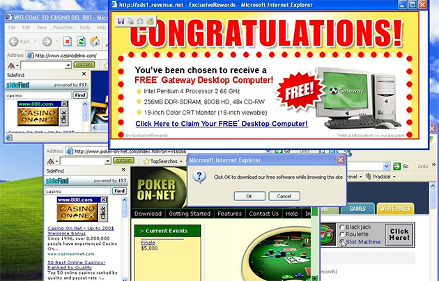
20 years ago, Ethan Zuckerman wrote the Javascript and server-side Perl to launch the first pop-up ad. And, even he feels sorry for letting loose such an annoying feature on the internet.
Remember the key is to make your pop-ups unobstructive and relevant. Try to offer such irresistible value to your visitors that they don’t feel intruded upon.
Getting pushy in your pop-ups, like the one below, might actually not persuade your customers to click yes…
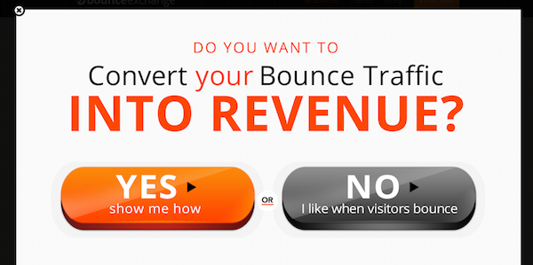
I would advise you to use more valuable copy explaining benefits to the user.
I do this when collecting emails at Quick Sprout through pop-ups.

Webmeup received 95% of its subscribers from popups in its first couple of months. But, see how they clearly list 3 major benefits of signing up for updates in their pop-up advert?
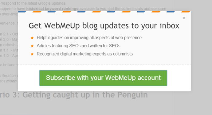
Making a pop-up that’s related to the content and designing it with an elegant overlay works well, like the Search Engine Journal pop-up below.
Its readers will be interested in SEO training. And, who doesn’t like discounts?

SumoMe, in its 30 day analysis of their List Builder tool (used for collecting 110, 313 emails from pop-ups) found that 3 kind of headlines worked the best.
- Social Proof showing the number of people who have already subscribed.

- Offering an incentive like a free eBook. Example – I offer my visitors a free website analysis with the Quick Sprout tool.
- Offering a discount on your product. An example is the SEJ discount on their training that I showed you above.
Since pop-up technology is controversial, you may have additional doubts regarding their timing, frequency and colors. Let’s tackle them one-by-one.
1. The time for showing the pop-up can make all the difference in its perceived value.
You can shove it up immediately after a new visitor lands on your website, in 3 to 5 seconds.
Or, allow him or her sufficient time to engage with your content, say for 30 seconds or more and then show him them the pop-up filme br mediathek herunterladen.
Obviously, you need to test your audience preferences.
But SumoMe found that 5 seconds is the sweet spot for collecting maximum emails. It’s sufficient time for a visitor to have a glance at your website. Cross the 5 second mark and the visitor might get busy with content on your website.
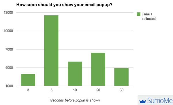
2. The next important aspect is whether or not pop-ups need to be turned off for your regular visitors. As a webmaster nothing will make you happier than collecting more emails.
But showing pop-ups to the same visitors again and again can be really annoying for them.
SumoMe found that it’s okay to keep asking your visitors for their emails every time they visit your website.
The maximum number of emails were collected for pop-ups showing every minute and month.
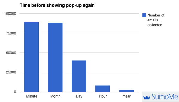
So if you find a reader revisiting your website, you can ask for his email. It’s not going to hurt them.
3. Generally your CTA should have a contrasting color to your website color spectrum for getting more clicks.
But using color psychology can also prove helpful.
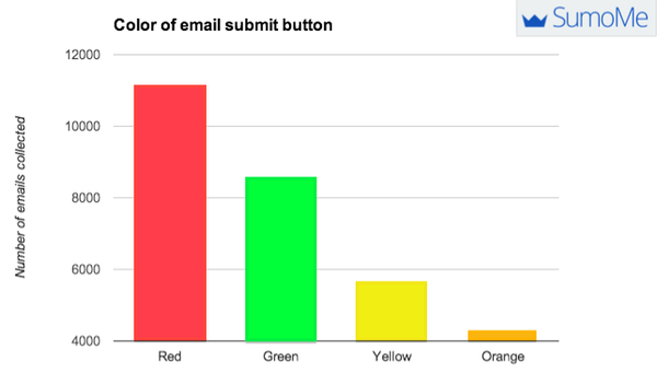
SumoMe found that a red colored email submit button invited the maximum number of email signups. The reason might be our association of red with stopping.
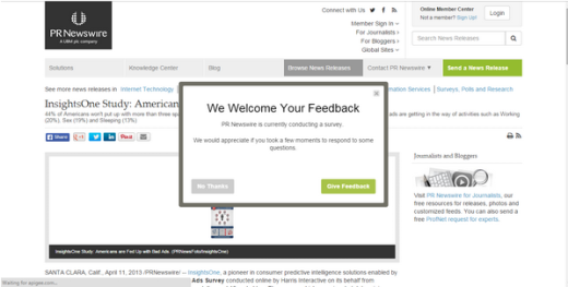
Besides an email subscription form, you can also ask for customer feedback in popups. Like PRNewswire does below.
What if you receive much lower engagements and higher bounce rates with pop-ups? Like Matthew Woodward did.
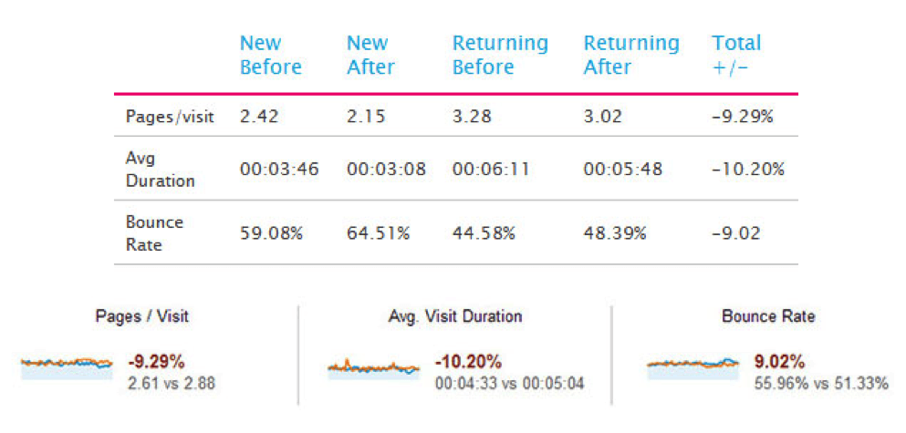
Then you can fall back to pop-up technology. They’re somewhat less obstructive and deliver good results. Let me show you 2 ways.
1. Present pop-ups at the end of your blog post. Just like Jonathan Fields does.
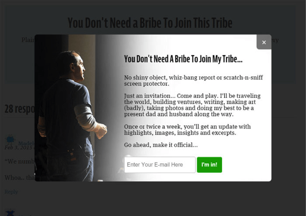
You can use a plugin like WP Subscribe Pro for implementing such a pop-up.
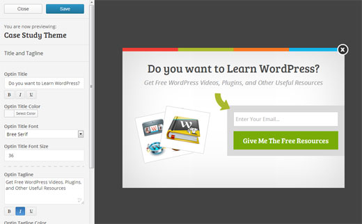
2. Show a pop-up when the user signals an exit from your website.
WPBeginner saw a 600% increase in their signups by using OptinMonster to set up such pop-ups.
5. Want a flash at my frames?
That’s a pretty ridiculous question.
And so is using too much flash or too many frames on your website.
Yes, flash might be visually attractive, but it’s badly (or rather not) indexed by search engines.
A homepage based on Flash is one of the biggest SEO blunders downloaden offline netflix. Look at the difference between how humans and search engines see a flash based web page.

That’s right. No bailing monkey information is visible to search engines. So it’s incredibly difficult to get such a website to rank in search engines, since there’s no content on your homepage for indexing.
If you think that Flash is liked by web users, then you’re wrong. Look at the results from a poll on Flash splash screens. 78% of respondents indicate that they don’t like Flash.
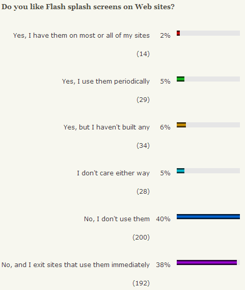
In fact, Google Chrome has already stopped auto-playing flash ads, because it hindered web browsing experience.
You should also not use flash in your website’s important elements. It seriously affects your website’s usability – you’ll experience issues with your navigation, bookmarking, font resizing, etc.
Look at the problems found with a flash based web design from a professional services company.

Most mobile devices don’t support Flash. So, if using Flash, you’ll need to create a dedicated mobile website besides your flash based desktop one.
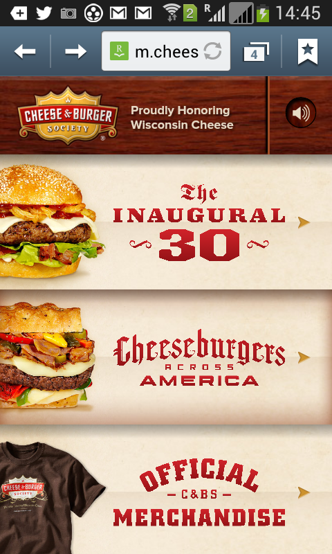
Just like CheeseAndBurger.com did.
Here is their flash based desktop version.

And here is how the CSS-based mobile version looks.
Remember we already discussed maintenance, resource and budget issues with having separate websites for different devices?
You should switch to flash alternatives like HTML5 for embedding videos on your website. You can also use CSS.
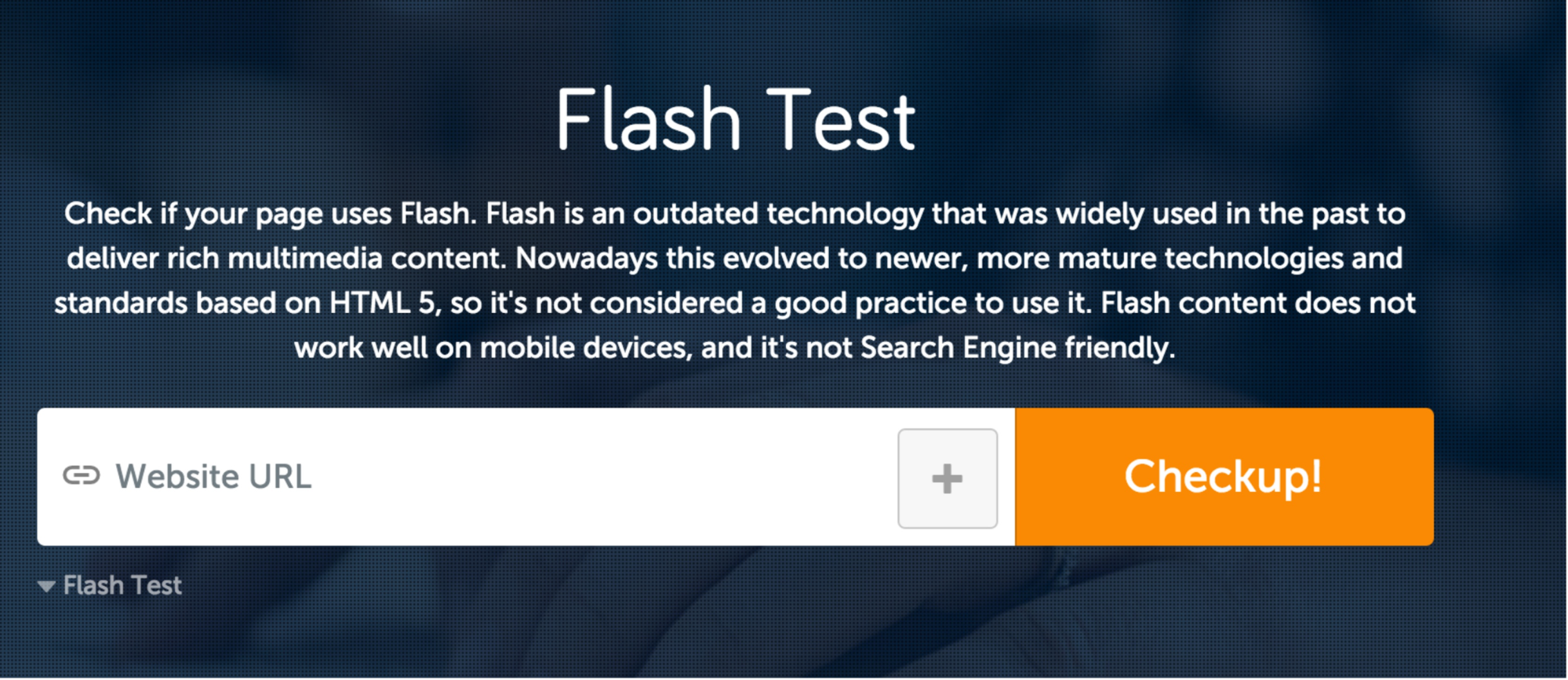
If you’re confused whether your website has Flash based elements, then you can perform a test using SEO SiteCheckUp’s Flash Test tool.
Similar to Flash, there’s another obsolete technology I want you to meet…
Frames.
The content inside them is hidden and difficult for search engines to comprehend.
Indeed Frames disrupt the entire concept of a webpage as the atomic unit of information. They’re difficult to navigate for the users.
Don’t prevent smooth crawling and indexing of your content by sectioning them with frames.
Note: I am not talking about inline Frames (or iFrames). They allow you to embed a page from another website in your website’s code. And they don’t affect your search engine rankings.
6. Filling up your webpage with every element imaginable
How many images are there on your homepage? And how many social media sharing icons do you use?
Fancy graphics, animations, redundant code and excessive widgets can lead to slower loading time. And, slow pages don’t just equate to bad user experience android iso herunterladen. They are also a critical search engine ranking factor (besides degrading your conversions).
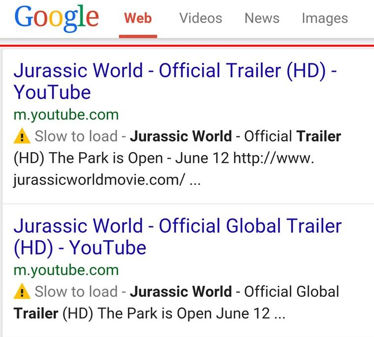
Google even started to show ‘slow to load’ labels in search results for mobile devices.
Let’s fix the speed-killing elements on your website.
Step #1 – Test your website with Pingdom speed test tool
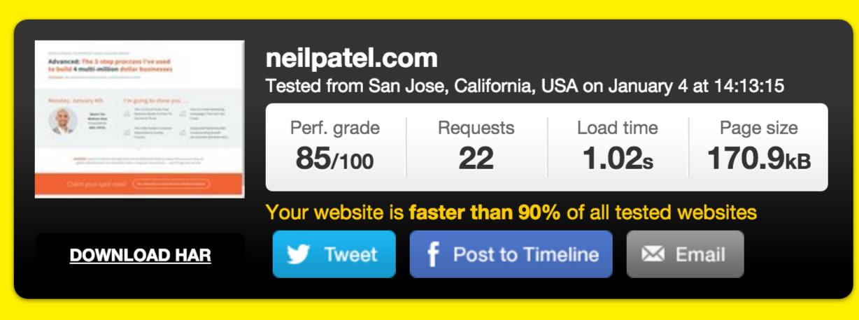
You’ll first get a summary of your page size and loading time along with a grade.
But you’ll also get a detailed breakdown of the specific files with their size and their contribution to page loading time.
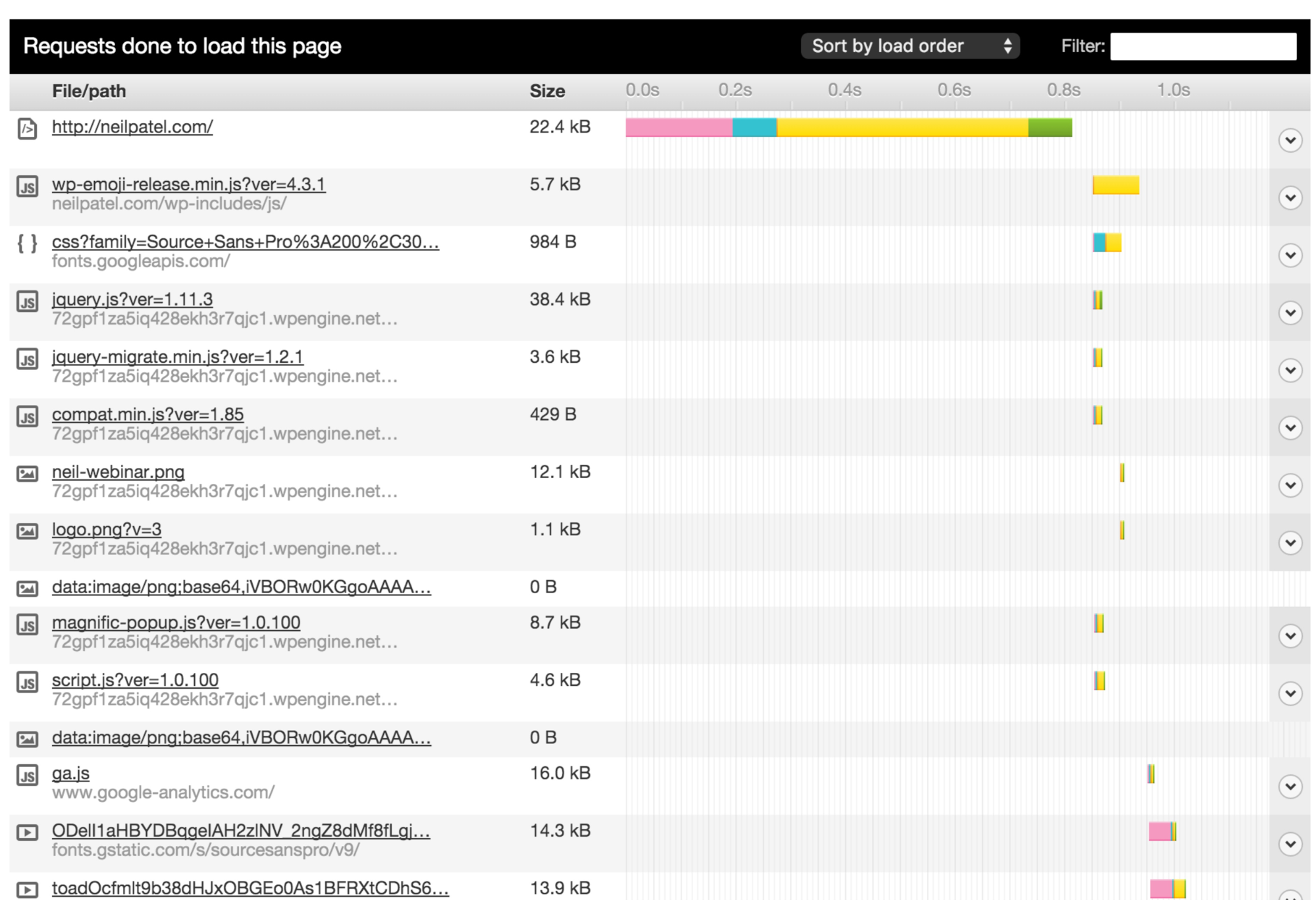
You can then work on removing heavy objects. But if you need high-resolution images and HD videos, then you can work on making the other elements on your page lighter.
A major factor that leads to slower loading time is the huge number of HTTP requests (up to 80% of response time for the end user is tied to them). You can use these 3 strategies to lower your requests.
Step #2 – Send the “pre-built” version of the page using page caching
If you’re running your website on WordPress, do you use a cache plugin?
Without activating page caching, you’re essentially asking the server to build your page every time a visitor requests it.
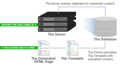
By using page cache, you can send the page to the user immediately.
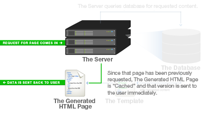
The only downside is that pages that require authentication cannot be cached. And if you made some changes to your page, the cache will need to expire for the changes to show up.
Step #3 – Clean your website’s code
This is a big hidden factor in determining your website speed. If you hire a cheap developer, there are great chances that you’ll get messy and disorganized code.
You need to delete all those empty HTML tags.
Lara Swanson at Dyn found these offenders that lead to a higher page load time.

Want to get started with cleaning your code? Here are 3 resources.
- Minify your CSS using Clean CSS.
- Clean your dirty HTML and JS at Dirty Markup.
- Follow these 12 principles for keeping it clean pou spiel kostenlosen.
Conclusion
Your developers, website designers and SEOs need to interact with each other and work in tandem to creat a seamless user experience.
Even if you’re doing a major site relaunch, your preference shouldn’t be to just meet the deadline, but ather to also maintain your search traffic and engagement levels.
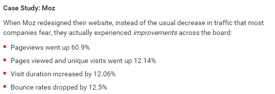
During their relaunch, Moz experienced an increase in their performance. You should aim to be like them by focusing equally on SEO and design.
Have you committed any of the above design mistakes on your website? Do you have any other critical SEO hampering design element in mind?


