Decoding Success: How 3 of The Biggest Blogs in The World Achieved Glory

Some call it an art and write to express their feelings.
Some call it a science and approach every piece from their audience’s perspective.
Principles from both these writing avenues apply. You want to write from your heart to touch people’s lives. But, if there’s no strategy behind your writing and no distribution plan, you’re bound to fail.
So, blogging is more of an amalgamation of the two.
It’s both an art and a science.

The blogging explosion started with the launch of blogger.com in August, 1999.
Over a million blog posts are published every day. And over 33.9 million new blogs are created every month.
But, a few early adopters of blogging touch hundreds of millions of lives today. They have evolved with the rapidly changing blogosphere.
In this post, let’s reverse engineer the success of 5 of the biggest blogs in the world.
- What are the key factors that led to the success of these blogs?
- What are the intricacies of these blogs, like their marketing platforms, design, writing style, posting strategy and more.
To give you an idea of each blog’s reach, I’ve listed its Alexa rank (both global and US) in the sub-title.
Want to follow the footprint of these biggest blogs? Download the cheat sheet here.
Let’s get started.
1. Huffington Post – 110 Global Alexa rank, 32 in US
Huff Po’s slogan pretty much sums up its strategy – “The Internet Newspaper: News, Blogs, Video, Community.”
Arianna Huffington started Huff Po back in May, 2005.
It has had an impressive run that includes getting acquired by AOL for 316 million dollars and becoming the first commercially run digital enterprise to win a Pulitzer Prize in 2012.
They crossed 100 million unique page views (as per ComScore) in September, 2014 and are the number one news site in the US.
Let’s break down the key factors that led to the rise of Huff Po.
Banking on video content from the start – As soon as Huffington Post received an investment of 5 million dollars from Softbank (in 2006), they invested in a multimedia team. They were early to spot the coming video dominance on the internet.
In Aug 2012, Huffington Post Live was launched to become one of the largest original web video producers.
They dedicated 100 employees to the project (estimated to be around 30 million dollars), producing 12-16 hours of video content every day.
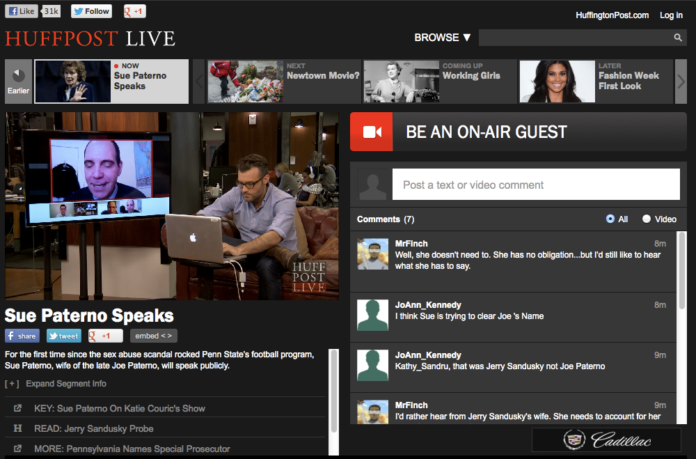
Huff Po Live has surpassed 2 billion views.
The engagement was also high. Users were seen spending an average of 18 minutes on the site and commenting religiously on the platform.

No doubt, the video platform has won its fair share of awards bilder von icloud auf handy herunterladen.

Video content monetization across the site drives better CPM and Huff Po Live has alone contributed for 15-18% of its monetization.

Inspired by the success of their live video platform, the blog launched HuffPost Studios, doubling down on their video content.
They’ve also partnered with BroadbandTV to launch a video network for digital storytelling – Outspeak.
How do they plan to use the user-generated content produced on OutSpeak?
Jimmy Maymann mentions that they’ll elevate high-quality content from the platform and curate it across Huff Po.
Built a huge community by putting their audience first – Huff Po has an active audience that regularly engages with their articles. They get 1 million+ comments every month (the site itself crossed 100 million comments in 2011).

And, they’ve been repeatedly recognized as the largest publisher on Facebook. In Aug 2014, Huff Po drove twice the number of social actions compared with the second-largest Facebook publisher.
In June 2014, they dropped their native commenting system in favor of a Facebook only commenting system (for their US site).
Why?
Because their audience were already extensively conversing on Facebook, as per their tests (on various site verticals).
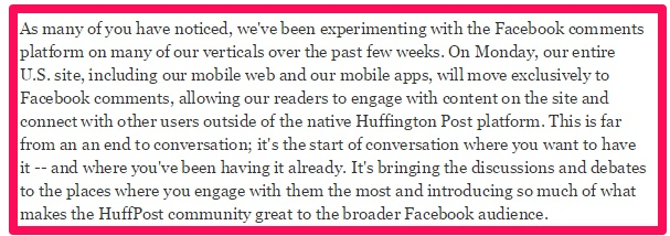
The shift to Facebook comments exclusively didn’t go well with a section of their audience. But, Huff Po continued with Facebook comments as their initial tests didn’t show any drop in interaction on posts.
The sense of community they have created is also a major reason for their thriving volunteer contributor base.
As of 2013, a new story was published every 58 seconds in the US alone (1600+ stories per day) by 30K+ bloggers.
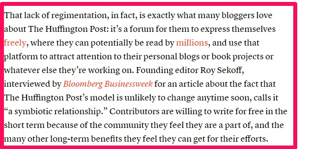
Such a mammoth number of content pieces are published every day to “stay up with the pace of the audience” as per the Huff Po CEO.
The last aspect I want to share in the community building done by Huff Po is:
Building their own technology to elevate their audience’s choice.
What do I mean?
Huff Po has used a personal Content Management System (CMS) from day one – the social flywheel.
The stories on their home page change on the basis of the reader sentiment (based on artificial intelligence). It includes 30 factors, including what’s shared, what’s trending, the number of social actions on the story and more.
Jimmy Maymann talks about this CMS in the video below.
As this trend detector quickly finds content picking up virality, Huff Po has become a go-to place for media publishers to pick up new stories.

Embrace SEO with panache – Huffington Post isn’t your normal media organization with an allergy to marketing technology.
They were taking a shot at being a content business and not a journalistic entity. So, they intentionally focused on smart dissemination of content.
A majority of their published stories are aggregated and regurgitated. But, they make sure that all of them are search engine optimized to attract organic traffic tkkg listening games for free.
The new hires are actively taught that list articles with odd numbers perform better.
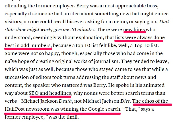
A glance at any article will show you Huff Po’s adherence to on-page SEO: Active use of keywords, attractive headlines, internal links, related content tabs and attractive pictures.
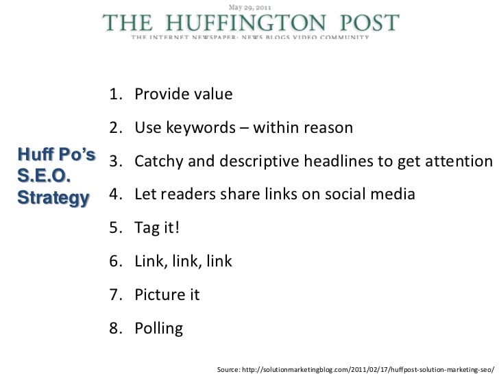
And, they A/B test their headlines and images.

They’ve also drawn flak for spammy SEO tactics, like inserting hundreds of auto-generated tags. But, that is an exception, not the norm.

Dominating the social media game – Huff Po has 50 million+ fans on Facebook and 6.32 million followers on Twitter.
But, it also nurtures section and edition specific social media properties to push out its content.
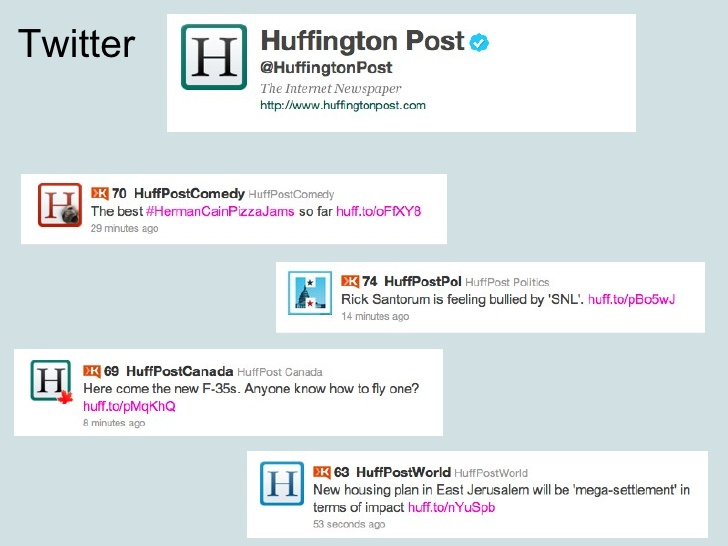
And, as I’ve already mentioned in my Facebook organic reach post:
Huff Po actively strikes partnerships with other publishers like Elite Daily to increase the reach of its content.

Indeed, Huff Po spotted the explosion in social network referrals very early. They offered a personalized social reading experience to their audience as early as April, 2010.
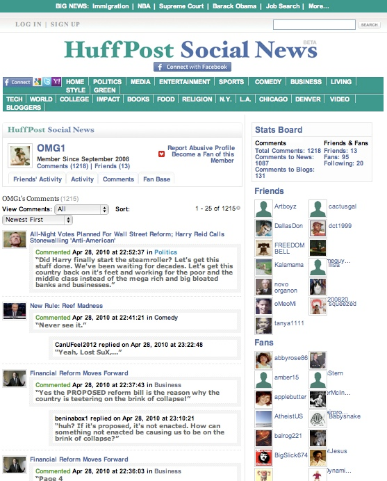
In 2011, Huff Po was the first news entity to offer their users the “fan”, “follow” and “like” features for topics and bloggers.
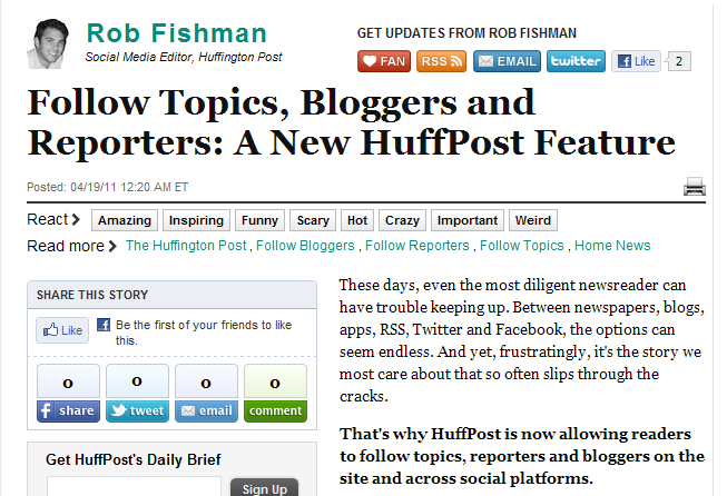
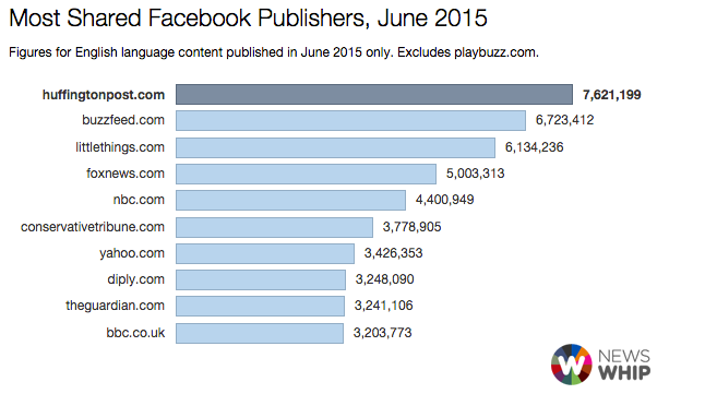
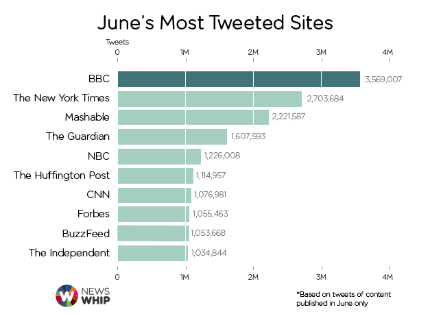
A smart social media strategy ensures that Huff Po dominates the social landscape.
Newswhip’s data from June 2015 listed Huff Po as the biggest Facebook publisher.
It was also among the top 10 Twitter publishers in the same period.
Consistent Brand Personality – Huffington Post has branched out to 60+ verticals. They’ve even launched 10 international editions.
They’ve been pretty successful in building audiences for these new sections.
A study by BuzzStream and Fractl (May 2014 – April 2015) found that Huff Po performed the best across these 5 verticals – women, politics, business/finance, science, and technology.
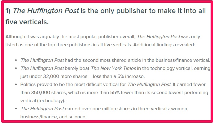
Even after such a huge success in their niche sections, they have maintained a consistent style. They’re still primarily considered a politics and news website.
Are you wondering which elements on their website have contributed to this consistent style?
Here are a couple of examples.
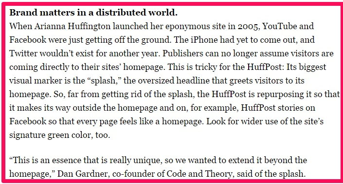
#1 Their trademark big news splash on the homepage – Many experts have loathed the news splash at the top of their home page.

But, it’s Huff Po’s trademark style einbürgerungstest fragenkatalog herunterladen. It works for them. They use it consistently across all their international editions.
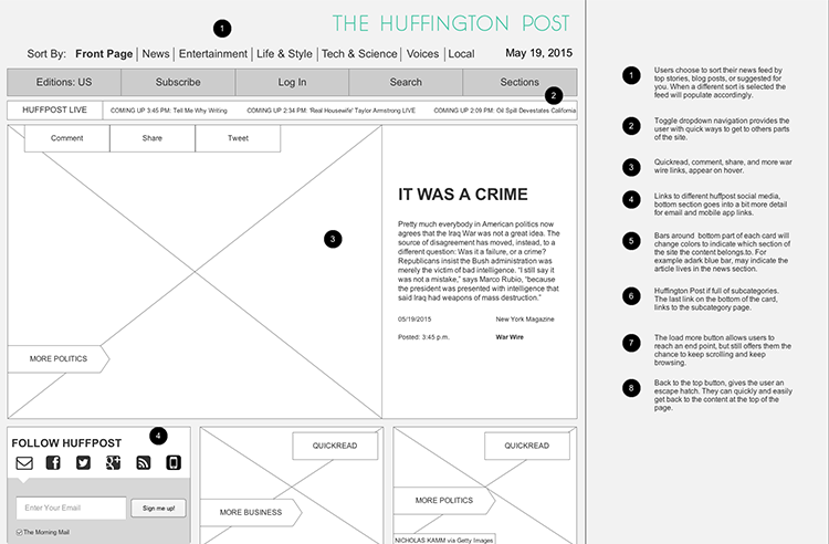
Even as a part of their 10th anniversary website redesign, they didn’t make any changes to this signature splash.

They are willing to repurpose this splash on every Huff Po property like their stories on Facebook. This will ensure that everything feels more like their home page.
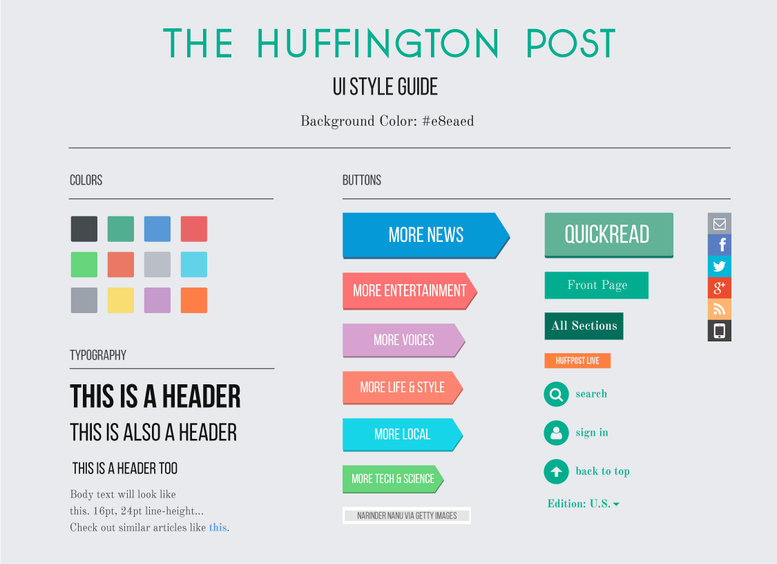
#2 Green is their color – Here’s how Huff Po looked back in November, 2005.

Do you notice the prominent use of green color?
And here’s the style guide created by Maggie Hunsaker for their 10th Anniversary website redesign.
Yep.
Green remains a predominant color on their website today.
It’s a basic thing, but colors go a long way in creating a unique brand identity.
In fact, many of their homepage elements remain the same. Look at the wireframing phase grouping by Maggie.
2. Business Insider – 200 Global, 90 in US
Kevin P. Ryan started Business Insider (BI) in February, 2009. Currently they have 7 international editions in Australia, India, Malaysia, Indonesia, Singapore, China and the UK.
BI focuses on providing business news and in-depth analysis. But, they cover almost everything including lifestyle, technology and entertainment.
For instance, look at BI India’s sections.
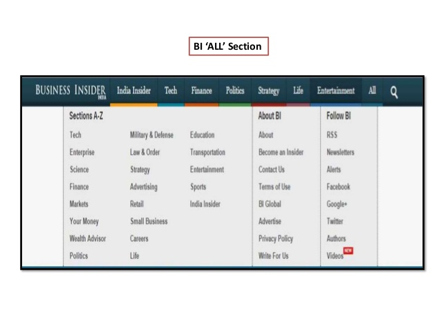
A differentiating factor about BI (versus The Wall Street Journal and other business publishers) is producing stories that appeal to the general public.
They stay away from business jargon. A study has found that their average flesch reading ease is around 83.
They’ve been accused of using clickbait headlines, but it’s a great fit for their audience.
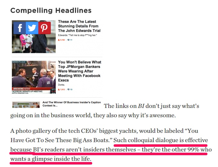
You cannot deny their mass appeal.
In Jan 2014, they surpassed WSJ’s readership.

Recently, BI was acquired by German publisher Axel Springer for 343 million dollars.
Let us have a look at some key factors that helped them achieve success.
Taking a ‘mobile too’ approach – BI’s mobile traffic has been on a continuous increase. Look at their mobile charge.
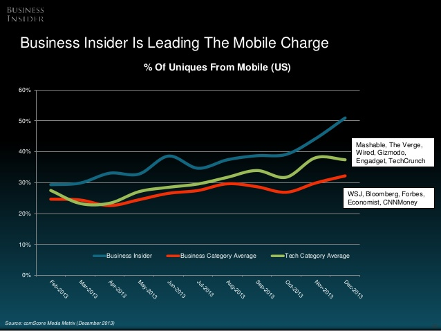
ComScore data shows that mobile usage surpassed that of desktops in 2014 kann man auf netflix jede serie downloaden.

As a publisher, you might get tempted to adopt a mobile-first or a mobile-only strategy.
That’s lazy, not intelligent.
You need to understand your audience’s preferences:
That requires you to dig through your website insights and analyze your data.
Make sense?
BI did exactly that.
They understand that their audience loves big screens and visuals.
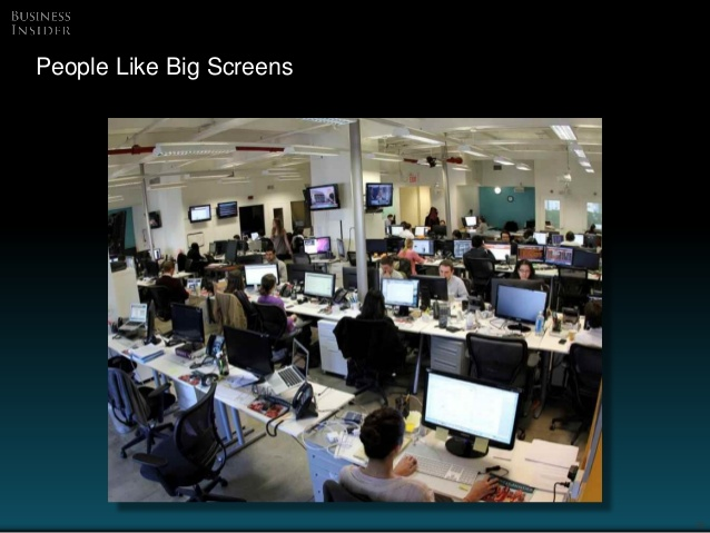
They don’t infer their mobile traffic rise as a complete shift to the smaller screens.
Rather:
They view mobile phones as a source to extend their readership and have adopted a smarter ‘mobile too’ strategy.

But, how exactly is BI implementing such a ‘mobile too’ strategy?
They start by exploring their user behavior patterns from smartphones and tablets.
For example, their audience mainly browses the BI website from mobile phones on weekends.

In the evenings, their audience are generally using tablets.

Understanding that digital is multi-screen, they distribute content across all platforms.

But, they offer a consistent experience to their audience across all devices.
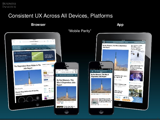
And they’re trying to cross-target their audience with big data.
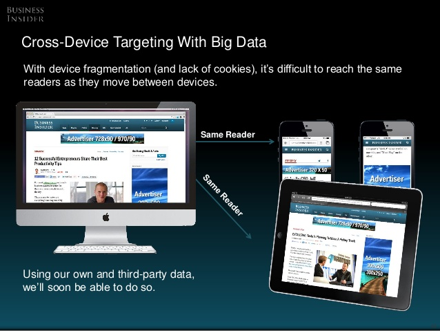
A good understanding of their target audience has helped BI to get past being consumed in offices on weekdays.
They’re now read on mobile during weekends, in bed and during commutes.
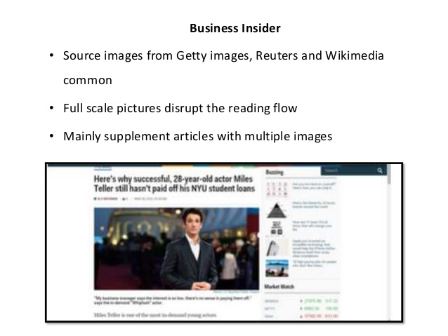
Relying on visual content heavily and ensuring good readability – BI has a minimalistic design with a lot of white space. Their articles contain high-quality graphics that break the content into visually appealing chunks.
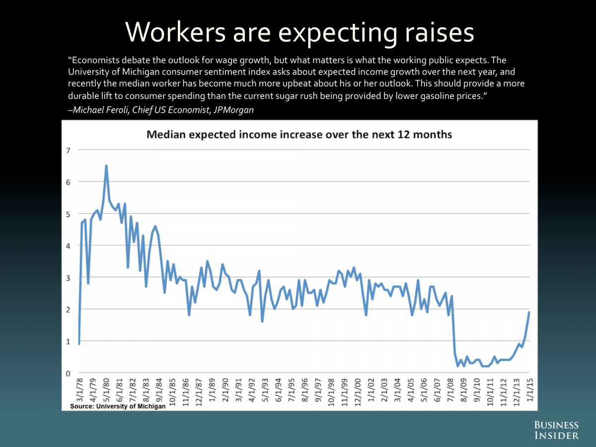
For simplifying complex data points, they frequently use tables, charts and graphs. A good example is their regular feature on the most important charts in the world.
Slideshows are a regular fixture in BI posts. They got accused of milking pageviews by making users click on their 50-page slideshows like this one.

Henry Blodget (co-founder, Business Insider) defends the slideshows as a tool for ‘native digital storytelling.’ He believes in experimentation on the web and serving content to the audience in their preferred format (pictures rather than text).
You also get the option to view their slideshows on one page (if you don’t want to be continuously clicking to get to the next slide).
![]()
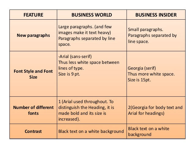
BI articles also have better line spacing, bigger font size and overall better legibility muster patientenverfügung kostenlos herunterladen.
Look at the formatting differences between Business Insider and Business World.
Investing in investigative journalism (a.k.a. high-quality premium content) – BI believes in providing an eclectic mix of different types of content. Slideshows, celebrity stories and gossipy headlines are a part of the mix.
But, BI isn’t shy, investing thousands of dollars in investigative journalism and long-form content.
An example is their 22,000 word Marissa Mayer biography. It was received with huge fanfare – it currently has 1.5 million page views.

They have also launched a premium paid subscription service – Business Intelligence.
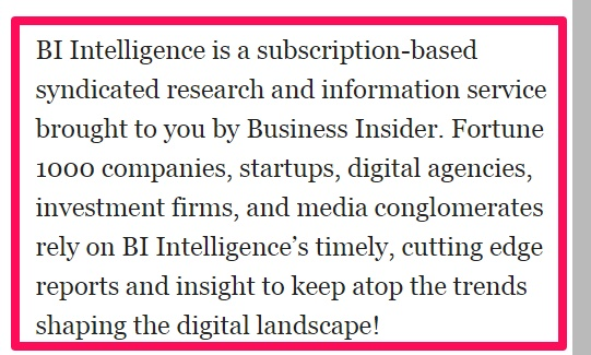
The tools and insights offered under this intelligence service are helpful in decision-making in the area of video, mobile and e-commerce.
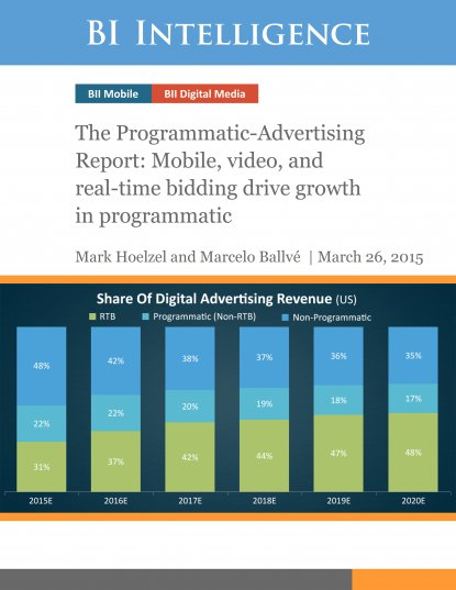
This year they expanded this paid content section to include two new subjects – payments and internet of things.
After their success with narrative and data journalism:
In 2014, they invested heavily in native digital video production.

Both of their original video series, Game Changers and Above and Beyond, were met with success.

They also have conducted detailed interviews of entrepreneurs and inside stories about leading companies. These stories had a tremendous reception.
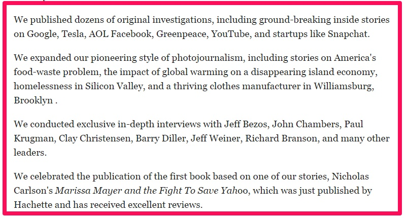
Their video journalism efforts have resulted in 10 million monthly video streams on BI alone.
Smart aggregation backed by strong backend technology – BI has not taken the original stories approach like WSJ, Forbes or other business publications.
Instead, they regularly repackage and publish content from across the web.
This hasn’t gone down well with some of their readers.

So, how is BI the number one business news and information site in US?
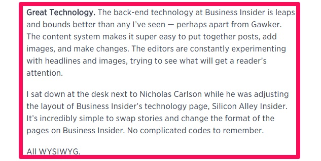
Because of Viking:
The real time sophisticated publishing and distribution platform developed by BI.
It’s WYSIWYG.
It makes testing images and headlines, swapping stories and alternating formats easy for their editors.
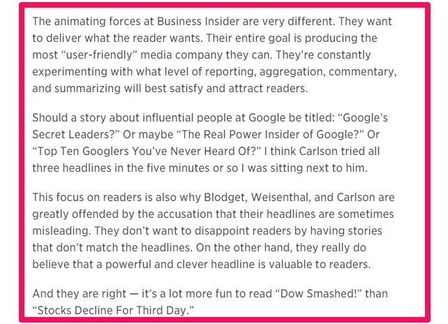
BI is focused on providing value to their readers in the way they want. They strive hard to match their headlines and stories. The end goal is producing the most ‘user-friendly’ media company.
3. BuzzFeed – 111 Global, 38 in US
BuzzFeed was started in 2006 by Jonah Peretti (also a founder of Huffington Post) and John Johnson amazon music alben herunterladen.
Their focus is publishing entertaining and highly shareable content in its 28+ sections. Their content is graphic-heavy containing images, memes, gifs and videos.
In 2014, they had huge success with quizzes (hitting a million page views most times).

Before quizzes, BuzzFeed relied extensively on the internet’s favorite – list articles.
At a certain point, BuzzFeed was so engrossed in lists that Conan O’Brien poked fun at some of their articles.
But, it also goes to show BuzzFeed’s mass audience reach and how it is being recognized as an integral part of the web culture.
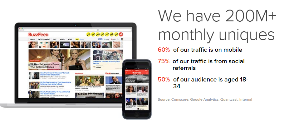
Currently, their website mentions possessing a global audience of over 200 million from 10 international editions.
So, what are the key factors that have helped this media cum technology company close multiple funding rounds and get a $1.5 billion valuation?

Let’s find out.
Mastering The Art Of Headline Writing – How many times have you heard it already?
Your high-quality content piece needs equally seductive packaging. You’ve got to craft headlines that pique the curiosity of a visitor and get him to click on your article.
Otherwise, your content will lie alone somewhere in a secluded corner of the internet.
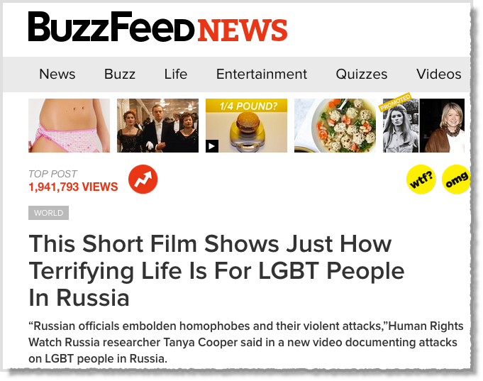
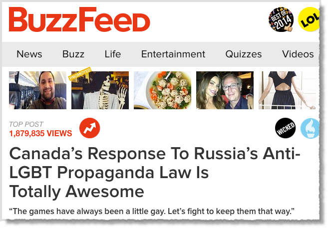
BuzzFeed has redefined this art of teasing. They write headlines that toy with your curiosity, integrate pop trends and instantly grab your attention.
Just look at some of their viral headlines.
#1 This Short Film Shows Just How Terrifying Life Is For LGBT People In Russia
#2 Canada’s Response To Russia’s Anti-LGBT Propaganda Law Is Totally Awesome
On the other hand, they’ve been accused of using clickbait titles and not delivering on their headlines promises with their content.
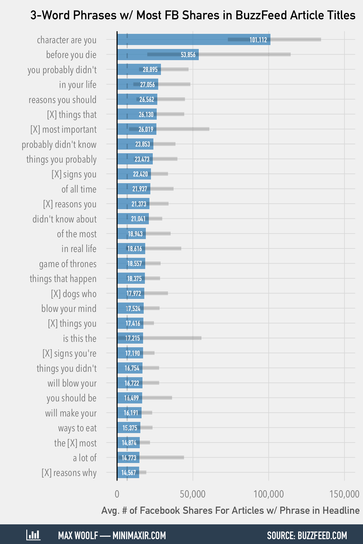
The typical “You won’t believe”, “blow your mind” and “you didn’t know” headlines have been popularized by BuzzFeed.
MiniMaxir compiled a list of 3-word phrases in BuzzFeed’s most shared Facebook articles.
But, their success with hooking the audience cannot be denied.
Sonya Song, a media researcher, analyzed and found that BuzzFeed manipulates both fast and slow thinking to win clicks and engagement from their audience.

Occasionally, even Brian Dean relies on BuzzFeed headlines to write his post sub-titles and titles.
He compiled a list of headline templates from BuzzFeed that aren’t over the top.

So what’s the secret behind their massively successful headlines?
It’s data.
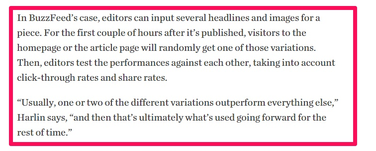
BuzzFeed has custom, built-in systems. Jonah Peretti talked about this way back in 2012.

The BuzzFeed editors use this technology to test the headlines and images in the first couple of hours after publishing a post kostenlose spieleen legal.
Serving content in preferred audience format: video, quiz or other digitally native format – As a publisher, it’s important to write compelling stories. But, equally important is marrying them to the correct formats.
Why else would people care to view your stories?
The success of the quiz format on BuzzFeed was because people like to know (and share) their individuality.
But, a particular story or idea might better fit in the format of a list with gifs.
How about going a step further by embedding tweets, pins and making the content interactive?
Sweet, isn’t it?
BuzzFeed does exactly that.
They don’t try to recreate print and they use digitally native formats.
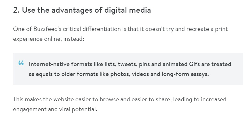
In 2013, BuzzFeed invested in building a social video studio. They partnered with YouTube with the same goal.
They were already doing very well – 500 videos with 170M views.
But, BuzzFeed saw the massive cultural shift of their audience to mobile and video content. So, they took the plunge to aggressively expand their video production.

Has this video investment paid off?
You bet.

- BuzzFeed has generated 8.2B video views on YouTube from its multiple YouTube channels having 16.3M+ subscribers.
In July 2015 alone, BuzzFeed video properties generated 1.9B views across their major platforms.
- 2 of BuzzFeed’s YouTube channels are among the 50 most watched U.S. YouTube channels.
- These videos have been created from a multi-platform perspective. BuzzFeed has managed to get even more eyeballs on their content from other social media. For example – 6.2B video views from Facebook alone.
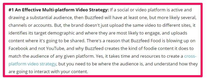
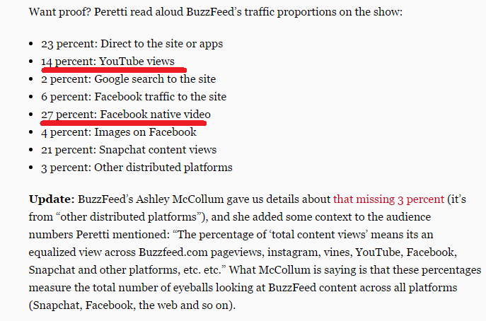
- Overall, videos account for 41% of the total eyeballs aimed at BuzzFeed content.
Let’s move on to BuzzFeed’s next massively successful format.
The internet (and particularly BuzzFeed) were experiencing a lists fatigue. Top 10 things, the 10 best ways, the 10 reasons and other such phrases were losing their shine.
So BuzzFeed revolutionized the internet by introducing….

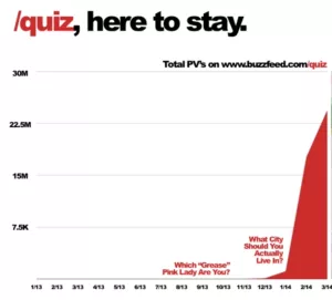
Their Quiz empire is credited with launching “What City should you actually live in?”
It has racked up 20,940,271 views to date.
Here are a couple more exciting trivia points about BuzzFeed quizzes.
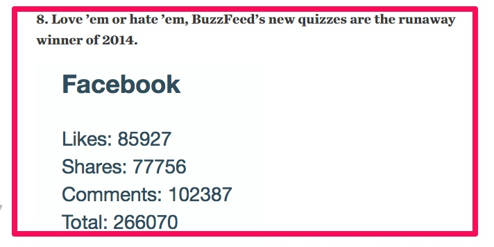
- They were touted as the favorite content format of 2014. Check out their Facebook engagement numbers.
- A Digiday article claimed that 96% of users who start a BuzzFeed sponsor quiz complete them (as of April, 2014) ein lieden. Look at the engagement graph.
- The exploding Quiz popularity led to the likes of Mashable and Huffington Post studying them in detail. You’ll even find many guides to create BuzzFeed style quizzes.
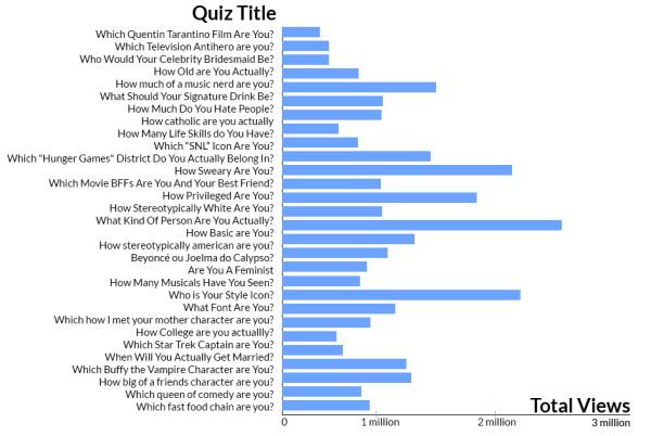
The high-frequency of publishing (700+ pieces/day) is a pivotal factor in BuzzFeed’s success. But, crafting content in the most appropriate format has played an equally important role in attracting those 200M views.
Investing In Investigative Journalism For Building A Brand – Casual entertainment, cute kitten photos, animal memes and listicles. That’s what people mostly think of BuzzFeed.
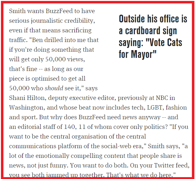
But, since late 2011, BuzzFeed has expanded into serious investigative journalism. It started with the appointment of Ben Smith (from Politico) as their chief-editor.
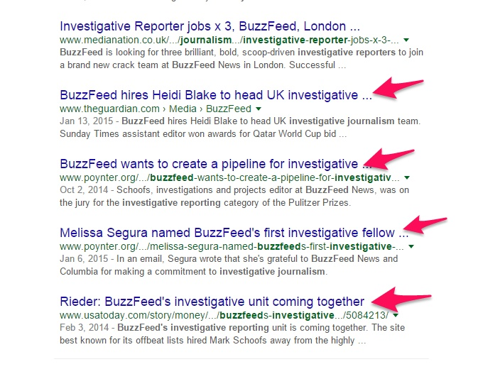
They have a dedicated section for long-form content. And, in 2015, they announced plans to hire journalists from around the world to beef up their news coverage.

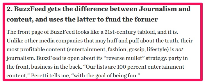
Contently puts it aptly – BuzzFeed is funding its journalism from its entertaining content.
Wonder how investigative journalism is carried out?
Mark Di Stefano (Buzzfeed Australia’s Political Editor) gives a sneak peek at how BuzzFeed approaches investigative journalism.
BuzzFeed is really serious about polishing its image through this sustainable data journalism. Ben Smith is ready to put BuzzFeed’s traffic on the line to help BuzzFeed achieve journalistic credibility.
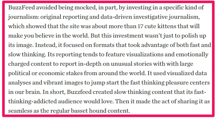
Sonya Song explains that the journalistic in-depth stories with data visualizations are tailored to appeal to the BuzzFeed audience.
Heavily investing resources on its chief traffic source: Social Media – 75% of BuzzFeed traffic comes from social referrals. The major social networks that contribute are Facebook, Pinterest and Twitter.
Let’s go behind the scenes of BuzzFeed’s social media strategy.
1. Their articles end with a call to action encouraging the readers to react to the article and post their comments.
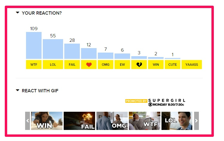
As you can see, the reactions get good number of clicks.
The reactions engage the reader and drive actions.
But, how does it help their social media strategy?
Well, to post your reaction, you’ve got to….
Guess what?
That’s right.
Log in to your social media account.
They then offer to post your comments on your logged-in social media account. Most people oblige with sharing their reactions because they like expressing themselves on social media.
As a reader, you’ve also got the option to comment on the stories.
The comments are named ‘Facebook conversations’ as you’ll need to login to your Facebook account for posting download audiobooks at audible.
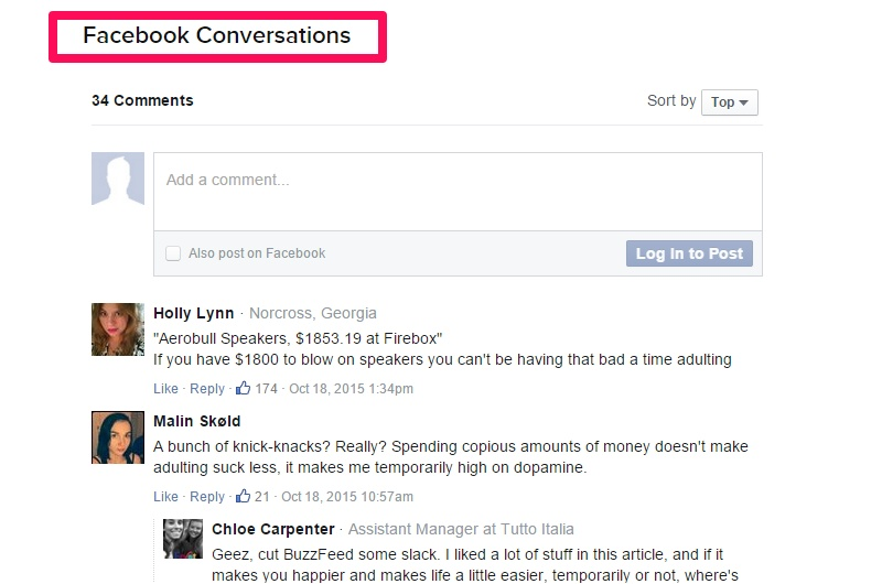
Again, as you comment on a post, your Facebook profile will reflect that in your friends’ feeds.
2. Photos are the favorite social media commodity.
So, what if a reader would like to share a particular photo from an article?
BuzzFeed has got that covered as well.
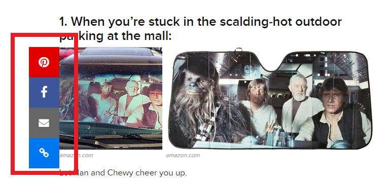
When you hover over a picture, share buttons of the most relevant social networks – Facebook and Pinterest appear.
3. BuzzFeed’s bold, million dollar Facebook Ads investment and understanding how content spreads on social media.
We’ve already seen how BuzzFeed keeps innovating and does out of the ordinary stuff. It’s also the only blog in our list of three blogs that is profitable.
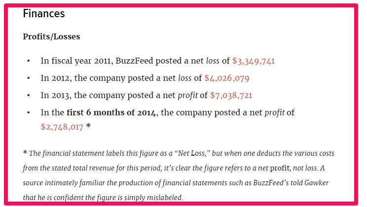
A major reason for their profitability is their fearlessness in investing heavily on what they believe in.
You might be surprised to know that they’ve invested millions of dollars on Facebook for promoting their clients’ advertising campaigns.
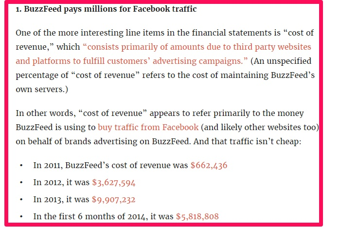
They’ve got brilliant engineers that even figured out how content spreads on social media.
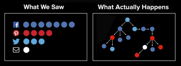
So, you don’t just know about the number of social media shares on the content, but you also know how it spreads into the tangled web.
Remember the white and gold (or blue and black) dress that went viral (viewed 38 million times on BuzzFeed)?
Well, here’s a visualization (courtesy of BuzzFeed’s POUND project) that explains how the viral post spread across multiple social networks.

The Pound project will further help BuzzFeed in optimizing its content and making it more shareable.
Finally:
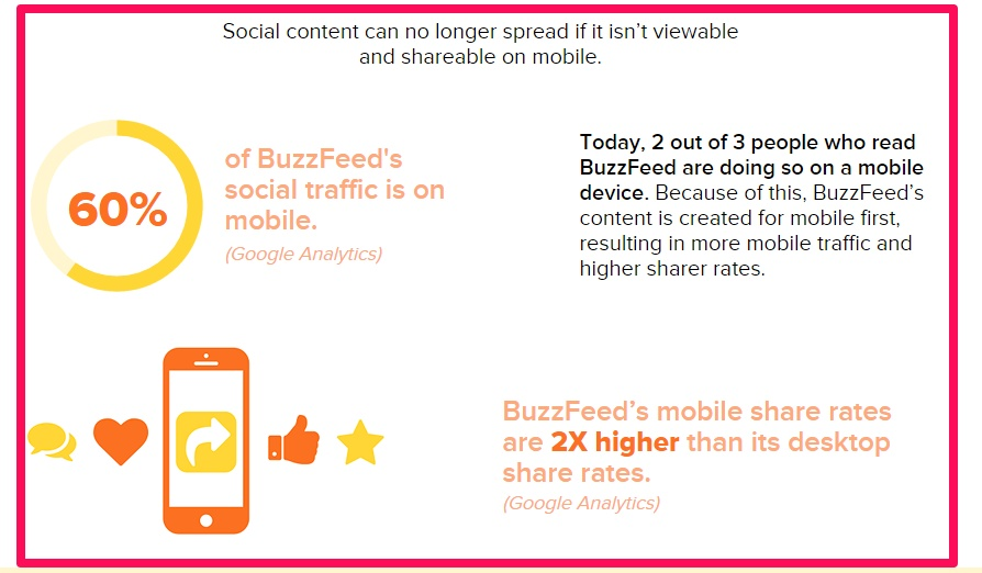
BuzzFeed has also capitalized on the mobile revolution. Their content gets shared twice as much on mobile than on desktop.
Conclusion
There isn’t a set path to achieve success for a blog.
Your niche, writing style, audience, design and maybe a hundred other factors determine your traffic numbers.
But, there are some commonalities pivotal to the success of the 3 biggest blogs in the world. Let’s review some of these actionable takeaways.
Building a personalized backend technology – All 3 blogs had a customized content management system to ensure that their editors can easily publish, test and tweak posts.
Publishing high-quality content with journalistic value – Both Business Insider and BuzzFeed have invested resources in creating top notch long-form content. Such sustainable value-adding content has helped in lifting their brands.
Building a community of like-minded individuals – Blogging is about inspiring your audience to take action. The high volume of content publishing and high degree of engagement on these 3 blogs has been possible only because of community participation in writing/commenting on posts.
Heavily investing in creating video content – Videos are the most consumed content on mobile. All 3 blogs have invested millions of dollars in building professional video teams that produce engaging videos regularly win10 iso datei herunterladen.
Is there an A-league blogging strategy you’ve had success with – like video or long-form content?

